SVG Mask and GSAP Animations 101
Published on: August 25, 2023
Back to the Blog indexUsing masks, we can control the visibility of one or more elements. Based on another shape, we can reveal or hide portions of an image or graphic applying levels of transparency or alpha values.
As an example, I’m going to create a basic composition with two images using a gradient mask. The following are the two photos that clearly show details corresponding to different contexts:
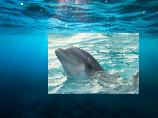
Applying a radial gradient to the dolphin photo, and making it work as a mask, we can get the following result:
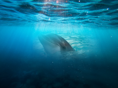
The dark part of the gradient hides the details we want from the dolphin image and shows the parts necessary for the composition.
Depending on the art direction, we can use a shape, with a gradient background to reveal or hide elements, so we get the desired results.
How to create masks in Boxy SVG
As with Clip Paths, we can create Mask works in any Vector Graphics tool like Illustrator or any tool you are comfortable with. The previous example was created using Boxy SVG and I’m going to show how you can work with it.
First, import the images you want. In this case, I’m going to import the sea and the dolphin. Next, over those images, we can create a rectangle or any other shape that will be used as a mask. I used an ellipse shape, like so:
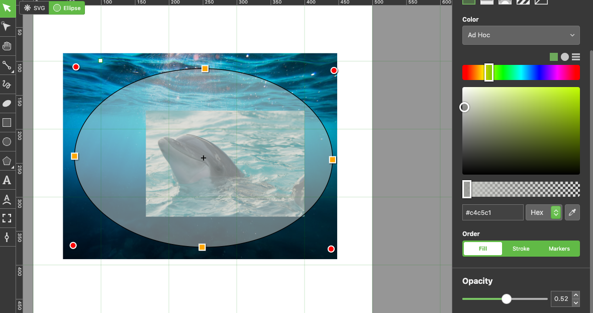
The ellipse in the previous image has a lower opacity so we can clearly see the dolphin. But, what we really need is an opaque gradient that helps us to hide and reveal details from the dolphin photograph as shown next:
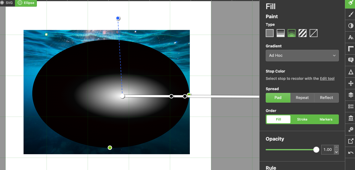
I think that this is the most important piece of knowledge related to masks: The BLACK part of the radial gradient will HIDE the details we want from the dolphin photo, and the WHITE part of the radial gradient will SHOW the ones we want. The following part of this short process is to actually mask the dolphin image with the ellipse. For this, first, we select the image and then the ellipse (shift + click), on the objects panel:
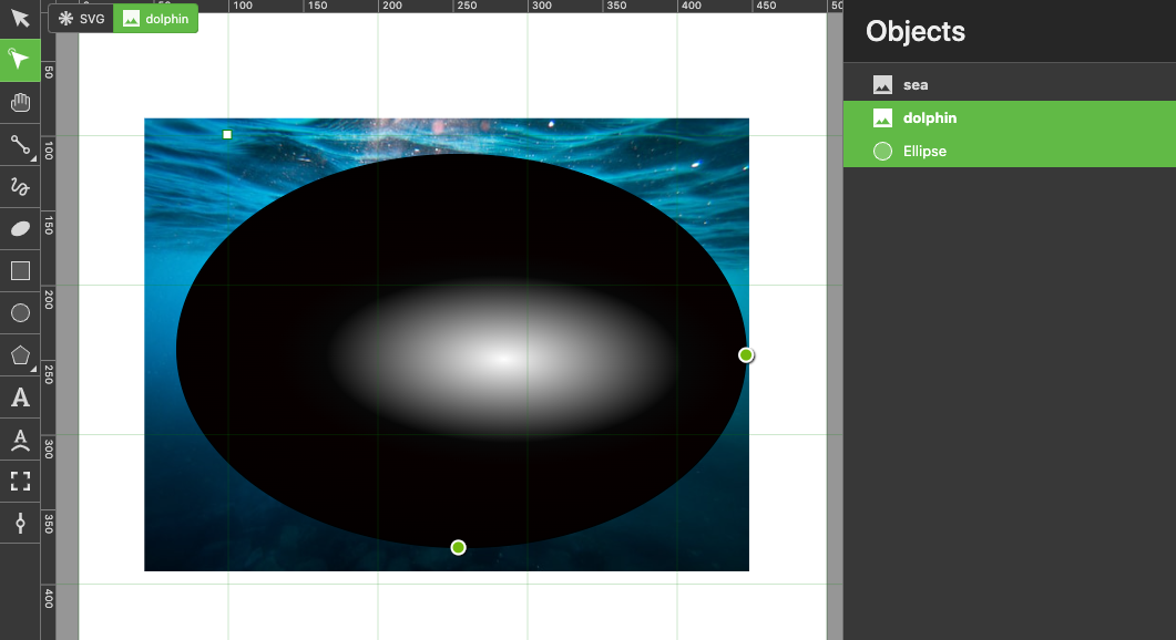
Then, on the Compositing panel, click the Mask button:
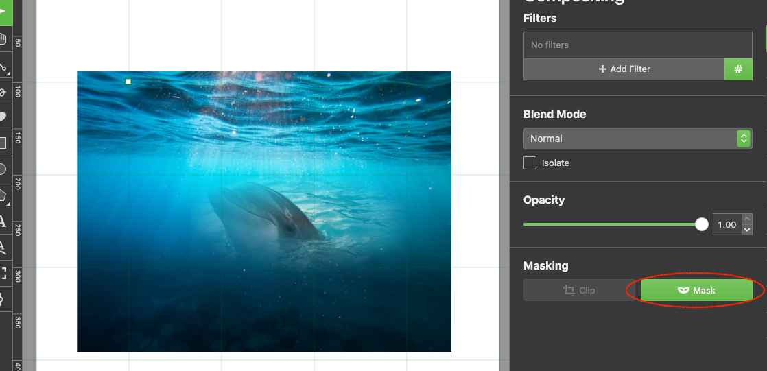
And the mask is ready, resulting in a nice visual composition.
Understanding the SVG masks generated code
In the bottom elements panel. we can inspect the generated code produced by the masked dolphin, and it must be something like the one exported to the following pen:
Take a look at the <defs> group of elements. We have an radialGradient element that defines the gradient applied to the ellipse which corresponds to the masking shape and is inside an <mask> element, of course. The <mask> element has an id attribute (mask-0) that we will need to apply to the dolphin photo.
In fact, if we examine the images, the first one doesn’t have a style attribute so the mask definitely is not applied to it. It corresponds to the sea background image. The second image does have a style attribute in which a property mask: url(#mask-0) has been set up.
We can move this property to the styles tab in Codepen and we would have this:
#dolphin {
  mask: url(#mask-0);
}
If you want to try this option, don’t forget to set an id for the dolphin photo, and remove the style attribute from it.
Now that we have understood the mask mechanism and its use with SVG elements, let’s try a GSAP animation!
Animating SVG masks with GSAP
Similar to SVG Clip Paths, animations that use SVG Masks can be accomplished with the use of libraries like GSAP. But it’s better to show how this works with a new example in which we’re going to animate the appearance of some graphics behind a mask.
Importing the images
In any graphical tool you’re comfortable with, import approximately five images, whatever you want them to be. In my case, I’ve imported 5 animal vectors from the images panel in Boxy SVG and placed them over a rectangle, like so:
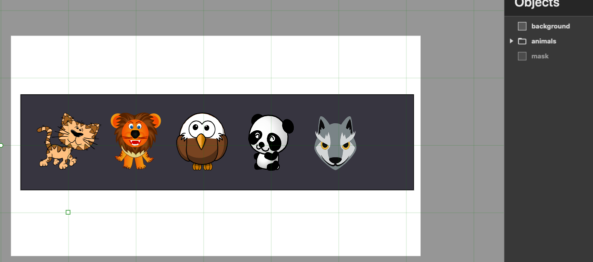
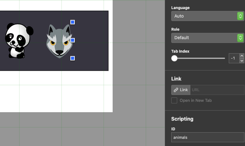
Be sure to group all the graphics and name your grouping, so you can refer to them later. I entered an id for this grouping, located in the Meta panel:
Creating the mask
I created another rectangle of the same dimensions as the background. This rectangle has a gradient, as you can see next:
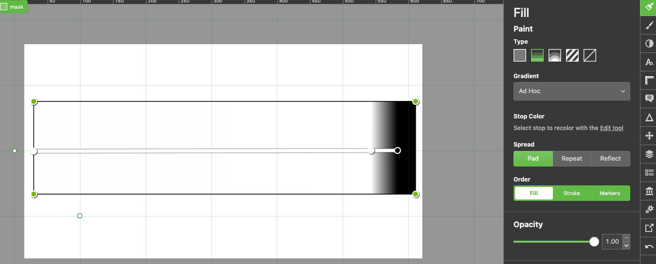
You may have noticed that there’s an “Edit Tool” option in the Fill panel of the shape. When you use this tool, there’s a gradient configurator that allows you to define stops for the gradient colors. In the example, there are 3 stops to get the result we need to mask the images below (animals), showing all of them but the end of the rectangle that contains them (background). Maybe, you will not notice it clearly by now, but later when we start animating, we’ll understand the utility of this gradient mask.
Masking the animal graphics
To mask the images, I first selected the “animals” group and then the mask gradient in the Objects panel.
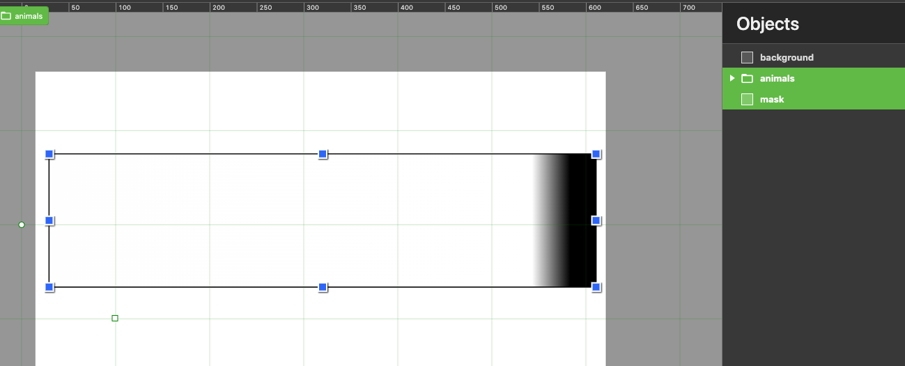
Next, I clicked the Mask option in the compositing panel:
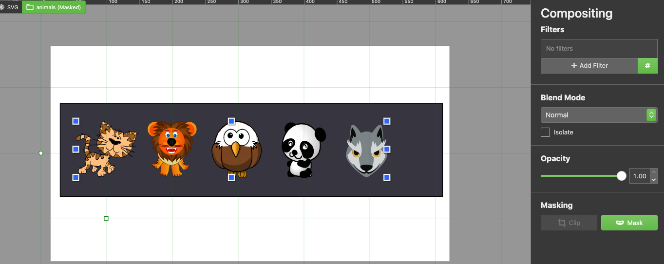
That’s all our work in the graphical editing tool. Now, let’s copy the generated SVG elements and export them to a pen, where we’re going to create code for the GSAP animation.
Animating the masking gradient rectangle
I’ve created this pen, already loaded with the GSAP library and its dev tools plugin. You can also see that I’ve also created the first part of the animation that moves the masking gradient rectangle from left to right, creating the effect of revealing the images masked by the gradient. Remember that this gradient has a black stop at the right extreme and, as it’s a mask, based on how this should work, it will hide the part of the image or shape it’s over, and the white section of it, will reveal the shape or image, like so:
Take a close look at how the images appear one by one while the mask is moving from a starting point of xPercentage: -100 (left to right).
There’s a sort of shadow that creates the effect of each image appearing from behind. But, maybe we can improve it a little further by making each image move while they show, so let’s add the following tween and see a subtle difference that improves the animation.
.from('#animals > g',{
  duration: 2,
  x: 500
},'<')
Enhancing the animation by grouping the masked images
Another way to animate the previous example, including the effect of the images moving while revealing, is to group the group of images and masking that external group. The following pen shows this variant implementation:
Observe that the tween is only applied to the group of images, and not the mask, making it more simple than the previous version in which we used a couple of tweens to get to the desired result.
Conclusion
Of course, we have just touched the basics of SVG Masks. You may want to review the MDN documentation to learn more about it. The following are other examples that use masks for text, dashed paths, and one with a combination of clipping paths.
- https://codepen.io/franc014/pen/LYXmVKv
- https://codepen.io/franc014/pen/eYQKJgq
- https://codepen.io/franc014/pen/bGQMvWR
- https://codepen.io/franc014/pen/gOQKaKL
Thanks for reading this post and I hope you have found it useful and interesting. See you next week.