SVG Clip Path and GSAP Animations 101
Published on: August 15, 2023
Back to the Blog indexOn SVG (and also in CSS), clipping is a technique that is used to restrict the visible area of an element to a specific region or shape.
The following is an example of this technique. We have an image in the first place, and below we have a hexagon that “clips” that image, showing only the part of the picture we want, inside the clipping area.

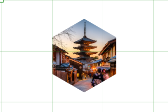
By utilizing clipping, we can achieve interesting visual effects, hide parts of an element, or create complex shapes for our content. Most importantly, we may use this technique to solve UI building challenges that otherwise would be difficult using other approaches.
Using Boxy SVG to create Clip Paths.
Boxy SVG is a great editor online platform to create all kinds of vector graphics and get immediate access to the generated SVG code. You can experiment online, creating all kinds of shapes and playing around with the editor tools to achieve the different modifications and effects for your compositions.
In the case of Clip Pahts, it’s also easy to clip an image with the shape you want. The previous Clip example is a Boxy SVG creation. Let’s review the steps to achieve that result. If you already know how to create Clip paths with Boxy SVG or any other tool like Illustrator, feel free to skip this part.
So, the first step is to import an image we want to clip. In this case, I’m using an image downloaded from Unsplash (Photo by Sorasak). You can import it by just dragging it into the editor from the directory you have downloaded it. Of course, don’t forget to resize the image to keep it inside the canvas.
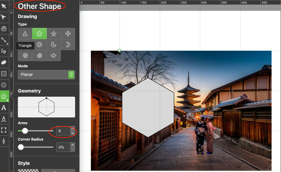
Next, open the “Other Shape” menu and select the polygon. Set 6 arms to create a hexagon. Drag this shape to place it over the image region you want to be clipped. In my example, I positioned over the Japanese house. Remember that It’s not important if this shape has a stroke or fill value.
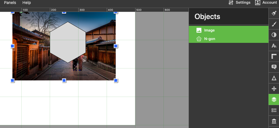
Then, select the objects option in the right bar navigation. In that panel, you have the image and the clipping path (hexagon). Click the image and then press cmd + click on the hexagon.
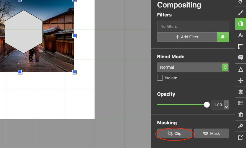
Go to the Compositing option, and press the Clip button on the Masking options group:
Finally, you can see the clipped image inside the hexagon, as we saw later in the first examples in this post.
Clip Path SVG markup syntax
In the Elements panel, Boxy SVG shows the generated SVG markup for your clipping. You can copy that SVG and place it in your favorite code editor. In my case, I created Codepen pens to illustrate further examples.
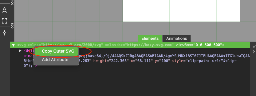
The SVG markup contains a <defs></defs> element block where the clipping path is defined:
<defs>
  <clipPath id="clip-0">
    <path
      d="M 262.918 135.623 L 325.836 171.949 L 325.836 244.601 L 262.918 280.927 L 200 244.601 L 200 171.949 Z"
      style="fill: rgb(216, 216, 216); stroke: rgb(0, 0, 0);"
      bx:shape="n-gon 262.918 208.275 72.652 72.652 6 0 1@50a324e5"
    ></path>
  </clipPath>
</defs>
The <clipPath> element has a child <path> corresponding to the hexagon that clips the image.
But how do we actually “clip” the image with this path? There are three ways to create a “relationship” between the clipping path and the image:
- In the
styleattribute of the<image>element, we can define the propertyclip-path: url(#clip-0), like so:
<image style="clip-path: url(#clip-0);" xlink:href="data:image/jpeg;base64,/9j/4AAQSkZJRgABAQEASABIAA
clip-0 corresponds to the id of the <clipPath> element in <defs>
- In an external CSS file, we can select
<image>element and again set up theclip-pathproperty to the clip-path id:
image {
  clip-path: url(#clip-0);
}
And finally,
- We can use the
clip-pathas a presentational attribute, on theimageelement:
<image width="363.263" height="242.365" x="68.111" y="100" clip-path="url(#clip-0)"
Try all these options on your own.
Notice that the image is outside the <defs> element, and so may other objects or images be on an SVG composition.
Animating a clip-path
Now that we know how to generate a clipping path composition, and understand its SVG element syntax, we can advance a little more to create animations that use this technique. In fact, here’s when it becomes more interesting. First, let’s tween the clipping path of the example I just finished creating in the previous section, and then we’ll review a more advanced demo:
This pen illustrates a basic tween that starts with the clipping path we created in previous sections. The shape gradually scales during 1.5 seconds, until the shape clipping the image, is so big that reveals it completely. As it’s a “yoyo” animation that repeats one time, it returns to the original clipped image in the shape of a hexagon.
Notice that we are selecting the hexagon clipping path #clip-0 path to animate. Let’s see what happens if we also want to tween the photo being clipped.
When we applied the tween to the image, we want it to move inside the clipping path. But notice that, instead, the image is moving altogether with the clipping path. Let’s fix this by using the clipping path, not directly on the image but on a group that contains that image. So, first let’s add a group around the image, like so:
<g>
 <image width="363.263" height="242.365" x="68.111" y="100" clip-path="url(#clip-0)" xlink:href="data:image
 ...
</g>
Then remove the clip-path attribute from the image and place it on the group tag:
<g clip-path="url(#clip-0)">
  <image width="363.263" height="242.365" x="68.111" y="100" xlink:href ...
</g>
Now, we have the effect of the image moving behind the clipping path. If we combine a series of tweens, we can create interesting animations. The key piece of advice here is that in a clipped group, we can place other shapes that can be part of a “behind the clip” animation, so creativity can expand with the use of this additional technique.
A revealing, sunblind-like animation
In this example, I’m going to create an animation on an SVG composed of an image that is going to be revealed by a series of vertical rectangles, creating a curtain or sunblind-like.
In Boxy SVG we can create the static composition we will animate. Start by importing a photograph, whatever you want, and then covering it with a series (5 or more) of vertical rectangles of equal height of the image, and each of equal width that summed up is equal to the width of the image. In the example below, on each rectangle, I have applied an opacity to just show it is going to be placed over the image.
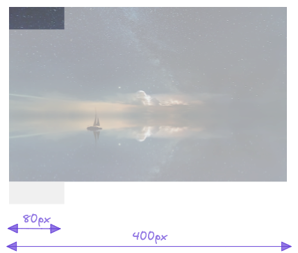
The final generated SVG and the animation can be explored in
this pen It’s a .from tween, which scales each rectangle from a zero value, in a staggered motion, that starts at the end, from left to right (from: 'end') and moves from top to bottom (transformOrigin: 'top'). The image is clipped by the group of rectangles that once animated create the illusion we’re revealing the image by a curtain or sunblind.
Other useful resources and examples
To learn more about SVG clipping, you can visit this article by Sara Souidan. And of course, the MDN documentation. There, you can find a deep dive on this topic which I think is crucial if you want more control over your clip compositions and of course, animations. The following are other GSAP animation examples you can review on Codepen:
https://codepen.io/franc014/pen/zYMLBKW
https://codepen.io/franc014/pen/QWJmegR
https://codepen.io/franc014/pen/MWzQNew
I hope you found this post useful. The basic concepts learned here can be further applied to your different needs or to learn more about them. See you in the next Post!