Create a Tailwind Mobile Header in Astro With A Svelte Island - Part IV
Published on: October 21, 2023
Back to the Blog indexThis is the last post on the implementation of a Tailwind, Svelte, and Astro header for mobile. We’ll focus on making the interactions more human-centric by using transitions, an important feature we need to add to any Web application, so users can perceive them more.
In fact, until now, we can perceive the closing and showing actions of components that make up the App Header, as fast, rigid movements that seem somehow robotic. To make these interactions more vivid, we can use transitions, and fortunately, Svelte has an extensive related API ready to be used. Let’s do it!
Identifying the components where we need to apply the transitions
Remember that our application example is pretty small and all we need is to make the appearance/hiding of the navigation and the toggle buttons in the header, subtler.
So, we need to apply transitions on the <NavBtn /> component, that corresponds to the toggle buttons, and on the <nav> element that renders the menu items.
Applying the transitions
The following steps can be used to apply the transitions to the components we described previously:
1. Wrap the component in a key block
Key blocks detect any change in a state variable (in our case a store variable related to the open/closed state of the navigation and the toggle buttons) and destroy and recreate their contents when the state changes.
Let’s do it first with the toggle buttons. Surround the <button> element defined in the component <NavBtn> with a key block, like so:
{#key $navIsOpen}
	<button on:click={toggleNavbar}>
		<slot />
	</button>
{/key}
Similarly, surround the <nav> element in the <Menu /> component with another key block:
{#key $navIsOpen}
	<nav
	class:navIsOpen={$navIsOpen}
	class="w-full hidden py-8"
>
	<ul class="text-center text-2xl tracking-wider text-slate-200">
		<li><a href="/">About</a></li>
		<li><a href="/">Products</a></li>
		<li><a href="/">Reviews</a></li>
		<li><a href="/">Contact</a></li>
	</ul>
	</nav>
{/key}
Whenever the $navIsOpen store variable changes, the transition will trigger inside the key block contents.
2. Apply the transition to the element or component
The second part is to just apply the transition. Svelte has directives designed for this and we can configure them depending on the motion we want the users to experiment.
We can use the transition, in and out directives for the different effects on different elements.
For example, for the menu buttons we can use the scale transition, like so:
//NavBtn.svelte

<script>

import { navIsOpen } from "./stores";

import { scale } from "svelte/transition";


function toggleNavbar() {
	navIsOpen.update((open) => !open);
}
</script>


{#key $navIsOpen}
<button class="absolute right-2 -top-1" transition:scale on:click={toggleNavbar}>
	<slot />
</button>
{/key}
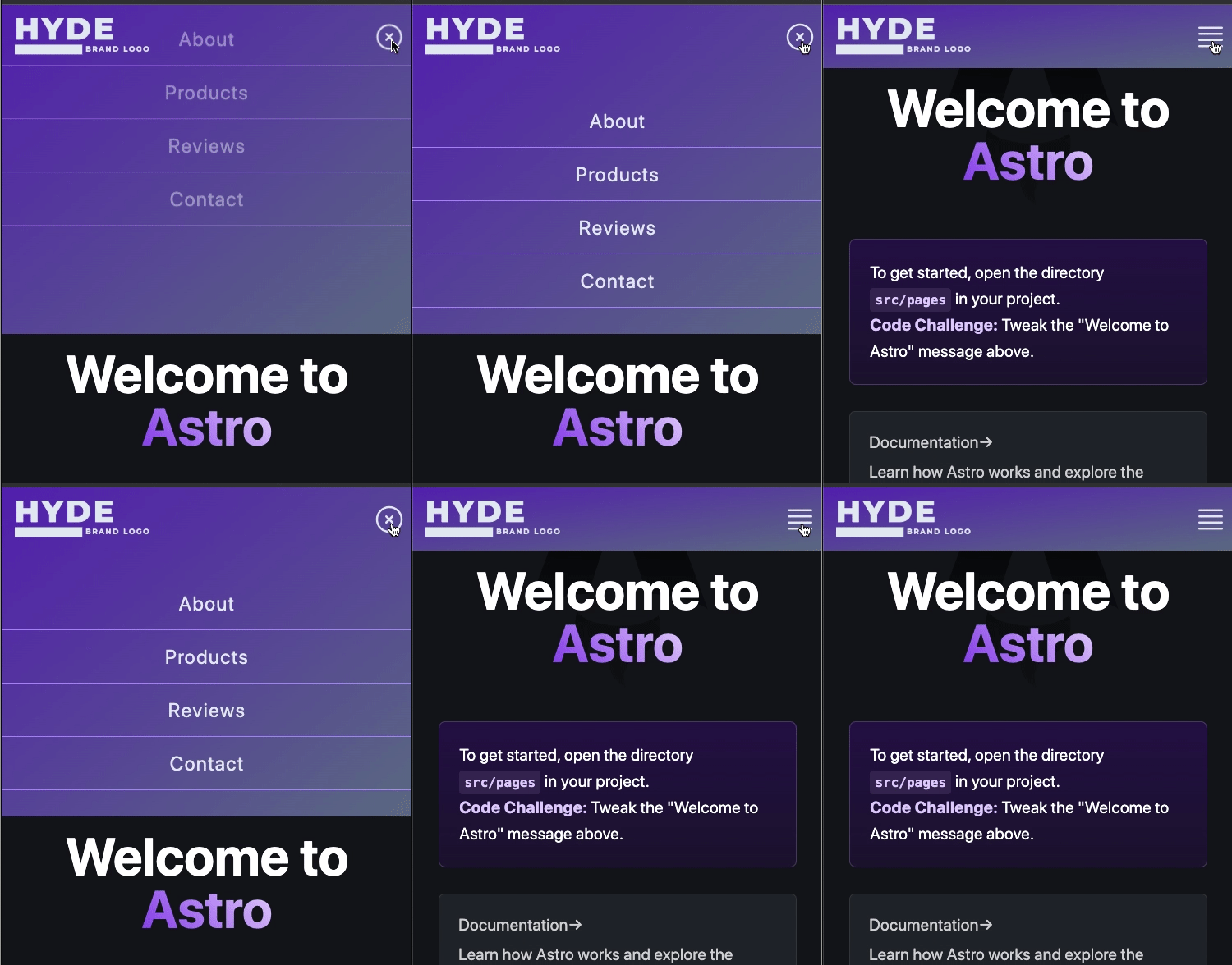
Here, we import the scale transition, and use it together with the transition directive. When you refresh your browser, you can check it and verify that the transition is applied, making the buttons change smoothly:

Notice that the transition makes each button scale up and down, making the appearance/hiding of them more noticeable to the user.
Notice also, in the code, that I’ve changed the position of the buttons to absolute so the replacement of one over the other, while the transition is executing, is perceivable.
Now, let’s do the same with the navigation. In the Menu.svelte component file import a new transition called fly
and two easings called sineIn and sineOut. In the following code snippet, you’ll see how we can define a new transition configuration using these tools.
<script>
import { navIsOpen } from "./stores";
import MenuBtn from "./MenuBtn.svelte";
import CloseBtn from "./CloseBtn.svelte";
import { fly } from "svelte/transition";
import { sineIn, sineOut } from "svelte/easing";

</script>


<div class="ml-auto p-4 relative">
	<MenuBtn />
	<CloseBtn />
</div>

{#key $navIsOpen}

<nav in:fly={{ y: -200, easing: sineIn }}
     out:fly={{ y: -200, easing: sineOut }}
	 class:navIsOpen={$navIsOpen} class="w-full hidden py-8">

	<ul class="text-center text-2xl tracking-wider text-slate-200">
		<li><a href="/">About</a></li>
		<li><a href="/">Products</a></li>
		<li><a href="/">Reviews</a></li>
		<li><a href="/">Contact</a></li>
	</ul>
</nav>

{/key}

<style>
	.navIsOpen {
		@apply block;
	}

	nav li {
		@apply py-4 border-b border-b-violet-400;
	}
</style>
This line of code in:fly={{ y: -200, easing: sineIn }} means that we’re using a fly transition with the in directive, that tells us it’s going to be triggered when the component is revealed. The nav is positioned to a y coordinate of -200px, and an easing function sineIn is also applied. When the navigation is hidden, another out transition is applied with a similar configuration as the in one.
Look at the following .gif image and see these transitions in action:

Of course, there are different options to configure your Svelte transitions. You can change the easing functions, the duration, and delay times, for example. You have many options to make your App interface look smoother while the user is interacting with it. I suggest you experiment with them, analyzing, for example, which easing function best matches your transition.
So, that’s a wrap! Thank you for visiting this series of posts and I hope you have learned one thing or two. Remember that you can visit the repository for the example demo in this series to further analyze the code and the dynamics I’ve shown throughout the 4 parts. Let me know if you want to know more about it or if you’ve any suggestions for me. Until next week!