Create a Tailwind Mobile Header in Astro With A Svelte Island - Part III
Published on: October 10, 2023
Back to the Blog indexWelcome to the third part of this tutorial series. In this post, we’ll continue enhancing our demo application, refactoring our state management to Svelte stores.
Going from component state to store state
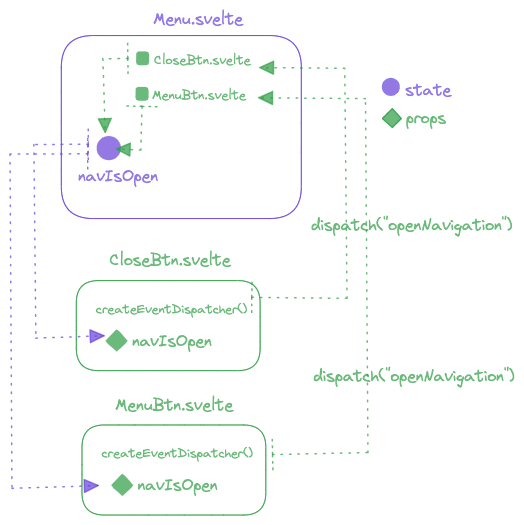
Currently, in our demo codebase, we have defined state at the component level in Menu.svelte. Our reactive state variable called navIsOpen is updated
from the toggle button components MenuBtn.svelte and CloseBtn.svelte which use the event dispatching technique.
We emit the custom eventopenNavigation and listen for it in the parent component Menu.svelte to update the navIsOpen state.
The following diagram shows this event flow:

But, as you may have already noticed, we’re repeating a lot of code between the button components. Both have the same code in their “click” event handlers, dispatching the same custom event “openNavigation”. I think we must refactor this flow now, and fortunately, Svelte has more options for us to work with the application state. Let’s explore Svelte stores and see how well this will work for us.
Creating our first store
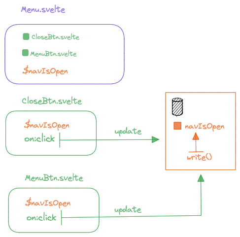
Stores in Svelte allow us to define state at a central location where not only components but javascript modules can access it in order to use it in their different functionalities. The following diagram explains the new flow we’re going to use in our application.

In our application, we’re going to transfer the component state navIsOpen defined in Menu.svelte to a store,
so we can access it from the MenuBtn.svelte and CloseBtn.svelte components. This process is as follows:
- Create a new javascript file called
stores.jsin the Svelte components folder - Inside that file, import a writable store:
import { writable } from "svelte/store";
- Create and export a store variable called
navIsOpen, and assign it to thewritable()function call. The argumentwritable()receives, is the initial state value.
import { writable } from "svelte/store";
export const navIsOpen = writable(false);
This way we have created our first store. To use the variable navIsOpen,
we need to import it into the components where we need it. Let’s start with the Menu.svelte store:
- Remove all the code related to the component state we defined previously. I’ve commented that code we don’t need any further.
<script>

import MenuBtn from "./MenuBtn.svelte";
import CloseBtn from "./CloseBtn.svelte";

/* let navIsOpen = false;
function toggleNavbar() {
navIsOpen = !navIsOpen;
} */

</script>
- Import the
navIsOpenstore variable:
<script>

import {navIsOpen} from './stores';

import MenuBtn from "./MenuBtn.svelte";

import CloseBtn from "./CloseBtn.svelte";
...
- The
navIsOpenis reactive, so any update we make to its value will affect all the places where we use it. Of course, one of those places in our application is thenavelement in theMenu.sveltecomponent, which is used to conditionally show or hide it, using theclass:navIsOpendirective:
<nav class:navIsOpen={$navIsOpen} class="w-full hidden py-8">
To use the store variable navIsOpen, it has to be preceded by the $ character. Never forget this,
because an important step of memory cleanup is involved when using this auto-subscription construct.
- By the way, the CSS that defines if the navigation is hidden or not, keeps intact. We still use the class name
navIsOpen
<style>

.navIsOpen {
@apply block;
}

nav li {
@apply py-4 border-b border-b-violet-400;
}

</style>
So now, we have established a relationship between this component and the navIsOpen store variable. if you manually change the initial
setup from false to true in stores.js, you’ll see that the menu opens.
Our next step is to update our store, via the menu and close buttons.
Updating the store from MenuBtn and CloseBtn components
navIsOpen is a writable store and it means that its value can be updated. To prove this, we’re going to change its value to true when we click the menu button and to false when we click the close button. In each of the components that abstract the buttons, let’s write the following code on each on:click handler. Of course, remove the previous one related to event dispatchers, given that we have replaced that event flow.
<script>

import {navIsOpen} from './stores';

//import { createEventDispatcher } from "svelte";

//export let navIsOpen;

//const dispatch = createEventDispatcher();
function toggleNavbar(e) {

navIsOpen.update((open)=>!open );

//dispatch("openNavigation");

}

</script>
Again, just for illustration, I’ve commented the previous code. But now, I’m importing the store, and on this, I’ve called the update() method.
As you can see, it receives a callback with the current value of the store variable. I’ve named it open.
The logic inside this callback is to toggle the store variable between true and false.
navIsOpen.update((open)=>!open );
Also, in the button element, let’s assign the store to the class:isOpen directive.
Remember that navIsOpen is reactive and will cause the effect we want on each element we use it,
for example, hiding or showing the button:
<button class:navIsOpen={$navIsOpen} class="block" on:click={toggleNavbar} />
The CSS block doesn’t have to change at all, as we have already pointed out in the previous section.
The same logic must be applied in the CloseBtn component.
Test again and check that whereas we have changed our event flow architecture, we keep our application working, and the code refactor has successfully been accomplished.
A step further in code refactoring
Refactoring is an ongoing process and while we’ve already made some refactoring on our application using stores, there’s still work to do. Indeed, if you take a look at the menu and close button components, you can clearly identify that except for notable differences in the SVG icon and the CSS to hide or show the button, they perform the same action of updating the state in the Svelte store. This is a clear opportunity for refactoring.
Let’s abstract the logic common to both buttons in one new component called NavBtn.svelte. In this new file:
- Replace the SVG icon with a slot. This will be the space we’ll fill with a different button icon, depending on which one will be inheriting. Also, remove the
class:navIsOpendirective and the Tailwind class. We’ll define the visibility of the button not on itsbuttontag, but rather on the SVG we’ll fill in the slot space. You’ll check it in a minute.
<button on:click={toggleNavbar}>

<slot />

</button>
- Remove the
styleblock from this component. Each button inheriting it will have its own CSS visibility rules, depending on the value of the store variable.
Next, we’ll refactor each button to use the NavBtn.svelte component as a “template”, filling the slot with the respective SVG icon and keeping the style block intact. Additionally, remember to define the classes needed to define the visibility of the button in the open tag of the SVG icon.
For example, the MenuBtn.svelte component will be refactored to this:
<script>
	import { navIsOpen } from "./stores";
	import NavBtn from "./NavBtn.svelte";
</script>

<NavBtn>
	<svg
	xmlns="http://www.w3.org/2000/svg"
	fill="none"
	viewBox="0 0 24 24"
	stroke-width="1.5"
	stroke="currentColor"
	class="w-10 h-10 text-slate-200 block"
	class:navIsOpen={$navIsOpen}
>
		<path
		stroke-linecap="round"
		stroke-linejoin="round"
		d="M3.75 5.25h16.5m-16.5 4.5h16.5m-16.5 4.5h16.5m-16.5 4.5h16.5"
		/>
	</svg>
</NavBtn>

<style>

.navIsOpen {

@apply hidden;

}
Take a look at the class:navIsOpen directive and the Tailwind class list. The block class means this button will be visible when loading the app, and the class directive will be reactive to the state change of the store variable: class:navIsOpen={$navIsOpen}
For the close button, the inverse of this logic is applied. Please, visit the branch that corresponds to this refactoring to check all the code details.
This way, we’ve arrived at the end of our refactoring. But to enhance our application demo, even further, in the next post we will add an important feature related to motion. Stay tuned!