Create a Tailwind Mobile Header in Astro With A Svelte Island - Part II
Published on: September 22, 2023
Back to the Blog indexIn part 1, we implemented a responsive Navbar using Svelte as an island in an Astro application. Parts of the UI (implemented with Tailwind) are off, though. In this post, we’re going to fix those design details to enhance our demo.
Changing the flex layout to enhance components’ positions
Let’s start reviewing our Header component where we have a flex layout and the items are displayed vertically (flex-direction: column). The current state of our Header component is the following:
---
import Menu from "./svelte/Menu.svelte";
---

<header class="bg-indigo-800">
  <div class="container mx-auto bg-gray-400">
    <div class="flex flex-col items-center">
      <div>Logo</div>
      <Menu client:only="svelte"/>
    </div>
  </div>
</header>
The div container that creates this vertical layout is the one with the Tailwind classes flex flex-col.
This keeps the Logo and the Navigation stacked vertically. Maybe this is what we want and we can leave it like that.
But It looks somehow, off to me; so I will change the layout to keep the Logo and the toggle buttons (the Menu and Close)
buttons side by side, and the Navigation stacked. We can accomplish that with the following changes:
...
<div class="flex flex-wrap items-center">

<div>Logo</div>

<Menu client:only="svelte"/>

</div>
...
Here, we remove the flex-col class and replace it with the class flex-wrap.
With this, we remove the vertical disposition of the parts that compose the Header, but we still use a flex container,
so that we can make the items “wrap” when they don’t have more space in their parent container:
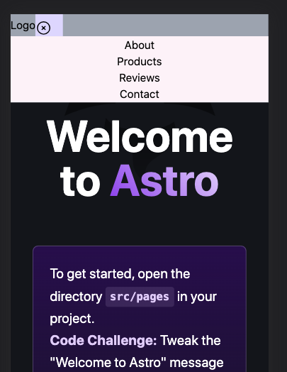
In addition to our latest changes, we still need to make the Close (and the Menu) buttons separated, and we might space the two flex items using the flex item property space-between.
But I’ll show you a little trick that allows us to get to the desired result without flex spacing and it’s all about using “auto margins”.
In the Menu.svelte component, we’re going to change the position of the toggle buttons removing the self-end class that is not needed anymore, and replace it by ml-auto:
<div class="ml-auto pt-2 pr-4 bg-violet-200">
<MenuBtn {navIsOpen} on:openNavigation={toggleNavbar} />
<CloseBtn {navIsOpen} on:openNavigation={toggleNavbar} />
</div>
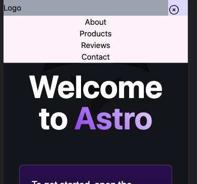
And finally, let’s remove the padding around the buttons (pt-2 pr-4) and make them look better just adding a unique padding size for all sides (p-4):
<div class="ml-auto p-4 bg-violet-200">
<MenuBtn {navIsOpen} on:openNavigation={toggleNavbar} />
<CloseBtn {navIsOpen} on:openNavigation={toggleNavbar} />
</div>
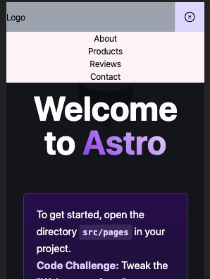
Now the buttons look better. Now, let’s improve the spaces around and between elements and components.
Enhancing space sizing in different elements and components
Adding space with Tailwind is easy. Let’s use its predefined sizes system to scale space in the Navbar and each menu item:
//Menu.svelte
<nav class:navIsOpen class="bg-pink-50 w-full hidden py-8">
	<ul class="text-center">
	<li><a href="/">About</a></li>
	<li><a href="/">Products</a></li>
	<li><a href="/">Reviews</a></li>
	<li><a href="/">Contact</a></li>
	</ul>
</nav>
<style>
.navIsOpen {
	@apply block;
}
nav li {
	@apply py-4 bg-indigo-200 border-b border-b-slate-800;
}
</style>
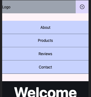
I’ve added block padding to the nav element with py-8 and in the style block, I’ve used the Tailwind directive @apply to style each menu item (in order to not repeat the style for each item in the HTML markup):
nav li {
	@apply py-4 bg-indigo-200 border-b border-b-slate-800;
}
Notice that I’ve added a border to the bottom of each list item. You should have a result similar to the following screenshot:
Using a “fake” Logo to improve our demo.
Let’s change the “Logo” text with a graphic one. I’ll download one from Canva, but you can use any graphic design you wish. Replacing the text with the logo, which will be an SVG, will result in something like this:
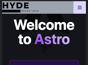
I’ve created a new Logo.astro component that contains the SVG logo markup. Once created, use it to replace the text Logo and the surrounding parent div:
//Header.astro
---
import Menu from "./svelte/Menu.svelte";
import Logo from './Logo.astro';
---
<header class="bg-indigo-800">
	<div class="container mx-auto bg-gray-400">
		<div class="flex flex-wrap items-center">
			<Logo/>
			<Menu client:only="svelte"/>
		</div>
	</div>
</header>
Looking at the application screenshot, we can see the Logo needs more spacing. Let’s add margin classes to improve its aesthetics:
//Logo.astro
<svg class="ml-4 my-4"
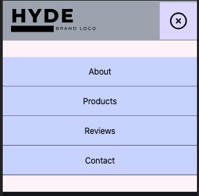
Finally, let’s increase the Menu buttons’ sizes a little so they also look better. In their respective components, change the width and height of the SVG:
<button class:navIsOpen class="hidden" on:click={toggleNavbar}>
<svg
xmlns="http://www.w3.org/2000/svg"
fill="none"
viewBox="0 0 24 24"
stroke-width="1.5"
stroke="currentColor"
class="w-10 h-10"
>
In the example, I have pumped them up to w-10 and h-10.
Using colors to improve the overall presentation
To improve the presentation, in the last step of this tutorial, I’m going to change the colors of the different elements. Maybe, all of the prototyping we’ve made so far with Tailwind should’ve been initiated with a design sketch in Figma or any graphical tool, but no worries and let’s finish this in the browser, leveraging the beautiful scheme of colors Tailwind offers to us.
Changing the header colors
I decided to change the header background color to a “slate” and “violet” gradient and to contrast, the Logo and Toggle buttons have a light gray color. If you’re following this tutorial, you should change the colors in the fill properties of the different SVG elements.
//Header.astro
<header class="bg-gradient-to-tl from-slate-500 to-violet-800">
Don’t forget to remove the test color classes set up at the beginning of this tutorial series.
One property you can use to change the SVG element colors in Tailwind is the class text-[color] altogether with the class SVG presentational property stroke="currentColor" For the SVG elements, I’m using the gray color text-slate-200, for example:
//MenuBtn.svelte
<button class:navIsOpen class="block" on:click={toggleNavbar}

><svg

xmlns="http://www.w3.org/2000/svg"

fill="none"

viewBox="0 0 24 24"

stroke-width="1.5"

stroke="currentColor"

class="w-10 h-10 text-slate-200"

>
The result will be something like this:
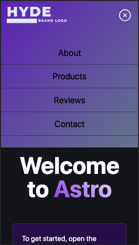
Notice I’ve also pumped the nav list items to text-3xl to make them more perceivable:
//Menu.svelte
<nav class:navIsOpen class="w-full hidden py-8">

<ul class="text-center text-2xl ">
To improve its contrast with the header background, let’s change its text color to the same gray slate. Also, separate a little each character:
//Menu.svelte
<ul class="text-center text-2xl tracking-wider text-slate-200 ">
In the style block, change each menu item border to a lighter violet
//Menu.svelte
nav li {

@apply py-4 border-b border-b-violet-400;

}
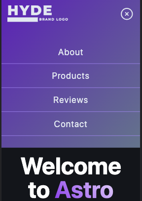
I think we’re done for today. We’ve made our Site Header more appealing with Tailwind color touches. Experiment with other colors in your own project to see how amazing they are.
In the next post, we’ll refactor the state management of our app, to the use of stores. Here will come Svelte again, so stay tuned!