Implement Drawing SVG path effect using GSAP
Published on: August 9, 2023
Back to the Blog indexUsing motion effects in User Interfaces helps to enhance their usability. Lately, lots of tools, like LottieFiles and Framer Motion, have been created in order to help designers and developers to create animations that make their interfaces more vivid and easier to use. CSS also has native features such as transitions and keyframe animations that have been used by developers since long ago. SVGs have brought up a great opportunity to create more realistic interactions, combining the power of vector graphics and the capability of animation libraries to release them from their static nature and make them behave as real objects, approaching more to the physical world users are used to. This, of course, it’s been also a solid step to more sophisticated user interfaces and enhanced usability.
One of the most exciting topics about SVG animations is implementing the effect of drawing a path around a shape or object. In this post, we’re going to learn about SVG strokes, and how to animate them, leveraging the use of the best platform out there: Green Sock.
Drawing a Path effect
Maybe you have already seen Websites or Applications that have elements or objects that have borders or strokes that are drawn or painted on the screen, automatically. The purpose of this illusion or animation might be to draw the user’s attention to some action or help them to complete some task, or simply to impress or delight the user while they are browsing a Web page.
For example, if you visit this site, this kind of animation is present in some parts of the home page such as the introduction banner, where a circle is drawn around the “of” word. Further, in the “Some of my selected Works” section, there’s another drawing ellipse around the “works” word.
The amazing Sarah Drasner has an immense portfolio of GSAP animations on her Codepen profile you may wish to explore. There, you can find Draw animations like this one representing technical aspects of Serverless functions. See how seamless and practical this animation serves to explain some difficult topics or key concepts. In fact, another use you may want to give to these sorts of animations is to enhance infographics and illustrate topics more attractively and boost interest in the user.
Key SVG element stroke attributes
To demonstrate the “Draw a line” animation, I’m going to use a square as a basic example shape, like so:
<svg
  width="738"
  height="376"
  viewBox="0 0 738 376"
  fill="none"
  xmlns="http://www.w3.org/2000/svg"
>
  <rect
    x="3"
    y="3"
    width="732"
    height="370"
    fill="#32936F"
    stroke="#28333E"
    stroke-width="6"
    stroke-dasharray="12"
  />
</svg>
The presentational attributes regarding the border of the shape are the basic components for the effect we want to create.
stroke is used to set up a color to the border, stroke-width which corresponds to the width of that border and the stroke-dasharray
attribute sets up a dashed style. The following Codepen uses the SVG of the previous example, but it has a modification on
the stroke-dasharray attribute.
The first number (20) corresponds to the size of the dashes and the second one (10) to the gaps between them.
In general, the stroke-dasharray attribute allows us to set up a pattern of dashes and gaps for the stroke of the
shape. Here you can find more
examples of patterns.
Finally, there’s one more attribute that is a key component for our animation goals. The stroke-dashoffset
attribute allows us to define an offset for the rendering of the dash array pattern.
Please, look at the examples on MDN
on how to use this attribute. To summarize this attribute, we can push (a negative offset) or pull (a positive offset)
the start of the dash array with an empty space. This “movement” of the dash array elements is what will
allow us to create the stroke Drawing effect.
Using GSAP for the animation
It’s time for GSAP to enter the stage. In fact, we could animate the stroke-dashoffset attribute with just CSS,
but Green Sock is much better for control, performance, and development experience, so I think this is the right way to go.
Working with GSAP is delightful. It abstracts all the mechanisms we may look into for an animation platform: timeline,
easing functions, and plugins; and you can animate almost any element and attribute we can imagine.
For SVGs for example, we can animate presentational attributes (those that define a visual style for an element) such as stroke, stroke-width, fill , fill-opacity, stroke-opacity and so on.
But first things first. There are different ways we
can install and start using Green Sock. The most straightforward one is to load it as a library in Codepen.
In fact, paid plugins can be used for testing purposes too, making it very convenient for us developers in order
to learn and practice.
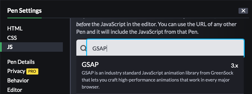
Whenever we want to start a new GSAP demo in Codepen, you must first load the library via its CDN.
You can search for it in the Codepen settings screen, like so:

Now that we have loaded GSAP in our Codepen, let’s analyze how we can create a Marching Ants animation around the square of the previous example:
const tl = gsap.timeline();

tl.to("rect", {
  ease: "none",
  strokeDashoffset: -24,
  duration: 1,
});

GSDevTools.create({ animation: tl });
First, we create a timeline using gsap.timeline() function.
This timeline enables us to add the tweens or animations we need for different elements we have in our markup.
The to() method creates an animation addressed to the rect element inside the SVG, corresponding to
the rectangle shape. The object argument of the to() function defines the animation with some properties.
In our demo, pay close attention to the strokeDashoffset property. It corresponds to the presentation
attribute stroke-dashoffset in the rect shape we learned previously. Here, though, we use a camel case
nomenclature for such type of attributes whose name is dashed-separated.
If we were to animate the stroke-dasharray attribute, we have to define the animation with
the property strokeDasharray
We set the strokeDashoffset to a value of -24, pushing 24 user units to the rendering of
the stroke-dasharray dash pattern rendering, as we learned previously.
We remove any easing to this animation to make it seamless (for the effect we want to achieve),
using ease: 'none' and finally, we set the duration of the animation to one second duration: 1
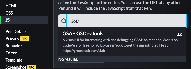
The GSDevTools declares the use of the GSAP DevTools plugin you can load the same way as we loaded the GSAP library in Codepen, like so:

You can control the animation at certain points during its execution which will help us to understand and debug our animations easily.
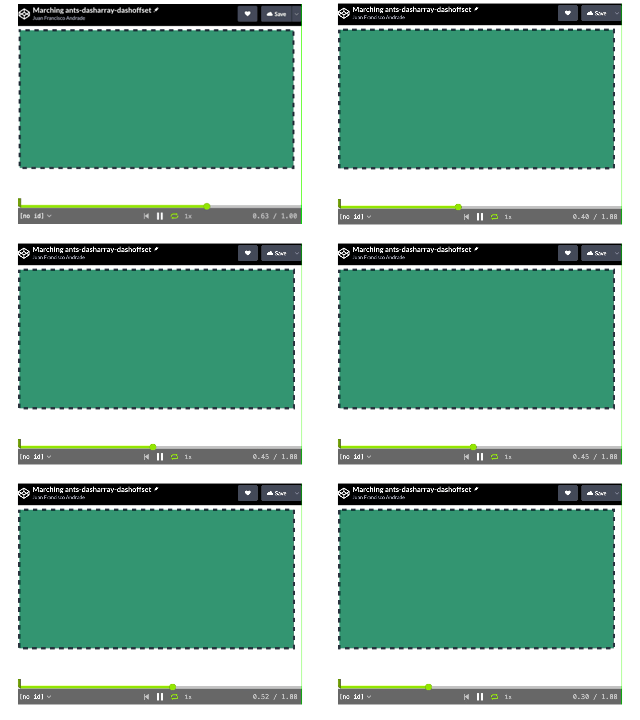
When we run the animation, we can see how the dashes are moving from left to right on an “ant march” sequence:

Drawing a line animation
The following pen shows another Draw path animation for a pentagon:
Take a look at the CSS section of the pen. The presentation attributes of the pentagon (defined by a path element in the SVG), are
now set up as CSS-style properties. Remember that if we don’t define a stroke property, we won’t be able to create stroke animations.
The Javascript code is a little more elaborate than the “marching ants” example. The main logic behind this animation is that we need
a dash whose size is the same as the length of the pentagon, and “to move” it (actually the drawing line animation), we need to offset that dash by the same length. To get the length of the path, we write this line:
const strokeLength = Math.ceil(path.getTotalLength());
And we initialize the stroke like this:
tl.set("#pentagon", {
  strokeDasharray: strokeLength,
  strokeDashoffset: strokeLength,
});
Then, we create a to() tween, which moves the offset to zero, and “painting” the line around the pentagon
during 2 seconds:
tl.to("#pentagon", {
  strokeDashoffset: 0,
  duration: 2,
});
This tween is the same as the following, but using the from() one
tl.from("#pentagon", {
  strokeDashoffset: strokeLength,
  duration: 2,
});
The next tween corresponds to “erasing the line”. Again, we are “moving” the stroke-dashoffset
value to the left or right, pushing or pulling the stroke dash, which, remember, has the same size as the
length of the pentagon.
.to("#pentagon", {
  strokeDashoffset: -strokeLength, //(+ to erase backwards)
  duration: 2,
},"+=1")
This all seems a little confusing. In fact, try to play with the stroke properties values,
and draw on paper the offsetting of the dashes to understand deeply how all this works.
In summary, don’t forget that the two main properties to make this kind of animation are stroke-dasharray
and stroke-dashoffset. And don’t forget to also review more about them in its
documentation.
Animating a stroke with the GSAP plugin DrawSVG
So far, we’ve learned how to animate strokes, manipulating the presentation property stroke-dashoffset.
It could be enough for simple animations, but sometimes you may want to have more control not only with the
dash offset but with the dash array. Some other calculations may be needed to achieve the effects we want
for our animations and complexity may arise. For those scenarios, it is better to use
the GSAP DrawSVG plugin, which allows you to create amazing drawing animations.
The basics of DrawSVG
The following video is a thorough introduction to using the DrawSVG plugin:
As you may already have concluded, the key part of the use of this plugin is the property drawSVG,
in the animation object of a tween. This property can have two values as a string: the first corresponding
to the start of the stroke and the other to the end, meaning, how much, in percentages, the start and the end of
the stroke is drawn along the path. Controlling the start and the end of the stroke allows us to create awesome
path animations. The following pen is a demonstration of how to use different values to produce different effects
on drawing a stroke.
Draw from a perceived shape center animation with DrawSVG
Let’s consider for this example the following Codepen:
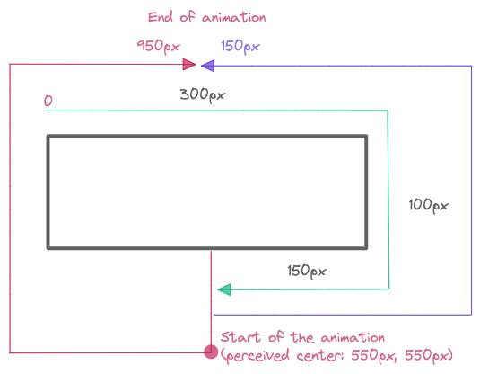
First, note that the SVG is composed of two rectangle shapes, the first which works as the “unpainted” stroke and the other one which would “paint” that stroke. We want to start our drawing animation from the bottom center of the shape and for this we need to calculate it, using its perimeter. As you can see, the rectangles have a width of 300px and a height of 100px. The origin of the shape is placed in the top left corner, so we should sum up the top of the rectangle’s length (300px) + right side (100px) + half of the rectangle’s bottom (150px), giving a total of 550px. This will be the start of the stroke as well as the end of the stroke. We animate from this point:
tl.fromTo('#draw',{drawSVG: "550 550"},
...
The finish point of the animation, considering the same origin (top left corner of the rectangle) is 951px (start of the stroke, going from the center to the left) and 150px (end of the stroke, going from the center to the right). The following diagram further describes the settings for the animation. The red and purple arrows show the direction of the start and end of the stroke from the center of the rectangle.

The same principle of this animation can be applied to other more elaborated animations, but considering percentages. The following pen is an example of how the curved line stroke extremes overpass its length (150%) to create a different effect for the start and end of the stroke.
Further practice
In this post, we have just scratched the surface of path animations. If you want to know more about them, and especially the use of the DrawSvg plugin, I suggest visiting the following pages, where you can find further examples to discover more about this amazing type of animation:
https://greensock.com/drawsvg/ https://codepen.io/collection/DYmKKD https://codepen.io/franc014/pen/ExOwRPq https://codepen.io/franc014/pen/qBQXpME