before and after pseudo-elements
Published on: September 9, 2023
Back to the Blog indexThe before and after pseudo-elements are used to add content before and after an HTML element’s content. Let’s suppose we have a h2 element and we want to add a decorative bar before it. We’re going to add and style this decorative bar using the before pseudo-element:
<h2>
Lorem ipsum dolor sit amet consectetur adipisicing elit.
</h2>
h2::before {
	background: tomato;
	width: 40px;
	height: 40px;
}
Please, run these two pieces of code in any dev environment you feel comfortable working in. It could be a new Codepen.
And nothing happens, OK?. Something is missing and without it, we can not render anything in that space. We need the content property inside the h2 CSS selector, like so:
h2::before {
	content: 'text';
	background: tomato;
	width: 40px;
	height: 40px;
}
If we inspect the heading element in Dev Tools, we can see that the ::before pseudo-element is now present and the ‘text’ content value is placed before its content, like so:
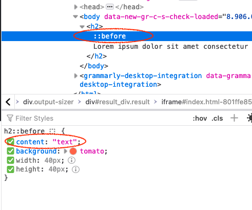
Again, the before and after pseudo-elements allow us to add content before and after the content of an element.
Now, we can see the word “text” before the heading, with a “tomato” background color. So the content property is essential when styling before and after pseudo-elements. We’ll review the different values this property can take during the development of this post, but for now, you can see we can place a string value. Notice that the width and height are not applied to that string.
What happens if we remove the “text” word and leave the content property as an empty string? Let’s see:
h2::before {
	content: '';
	background: tomato;
	width: 40px;
	height: 40px;
}
Once again, nothing is rendered. There’s another important key concept to learn for these pseudo-elements and it’s the fact that they’re positioned “inline” by default. So, for the first example with text, the content worked fine because there was text in it. But as with any empty element, it would only work if we convert the pseudo-element to a block element, like so:
h2::before {
	content: '';
	background: tomato;
	width: 40px;
	height: 40px;
	display: block;
}
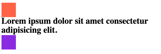
We can finally see a tomato square, a 40 x 40 box rendered before the h2 heading, as the following image illustrates:

If we applied the after pseudo-element we would have the same square, but placed after the h2 heading:
h2::after {
  content: '';
  background: blueviolet;
  width: 40px;
  height: 40px;
  display: block;
}
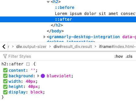
Open the Dev Tools, and you’ll see that the heading has not an after pseudo-element:
Other values for the ‘content’ property
So far, we’ve just seen the basic use of the content property with before and after pseudo-elements. In this section, we’re going to discover more about the utility we can give to it when implementing parts of UIs with CSS.
Using an image as the content property
For a mainly decorative purpose, we can set the content property with an image. For example, the following snippet of CSS sets a paragraph element before a pseudo-element with an image:
p.image-before::before {
  content: url(//unsplash.it/100/100);
  width: 100px;
  height: 100px;
  display: block;
  margin-bottom: 1rem;
}
As an example, you may want to create a p element with a class of .image-before and apply the previous CSS code that uses a random image from the Unsplash Website, but you can set it up with any image from your local drive or from any assets folder you’re using in your codebase or framework.
In the previous example, you can also find it in this pen you may want to fork it.
You can experiment with another image that is purely decorative with other dimensions that match your design.
Using an attribute value as the content property
Another way to set the content property value is to use an attribute from the element.
A useful application is the creation of tooltips with pseudo-elements.
The tooltip text can go in a data-tooltip attribute, for example, which then, can be extracted
in the content property of a ::before or ::after pseudo-element, like so:
<a class="tooltip" href="/" data-tooltip="This is a tooltip">A tooltip</a>
a.tooltip {
  position: relative;
  display: block;
  max-width: 150px;
}

a.tooltip:hover::after {
  content: attr(data-tooltip);
  position: absolute;
  top: -34px;
  right: 20px;
  padding: .5rem;
  background: hsl(220 20% 50%);
  color: white;
  box-sizing: border-box;
  border-radius: 5px;
}
This example shows a link with a class of “tooltip” and a data-tooltip attribute that contains the
text “This is a tooltip”. On the hover state, we’re using the ::after
pseudo-element, whose content property value is attr(data-tooltip).
Notice that the pseudo-element is placed after the :hover pseudo-class, and also notice that the tooltip has an absolute position,
so we can adjust the presentation of the text over the link.
In summary, use the content: attr([attribute]) in order to use its value as a ::before or ::after pseudo-element’s content.
Enumerating lists of items
Another great application of ::before and ::after pseudo-elements is the creation of counters and enumeration of lists. I think it’s better to explain with the following example:
<section class="enumeration">
<h3 class="enum-subtitle">Lorem ipsum dolor sit amet consectetur adipisicing elit. </h3>
<p>Lorem ipsum dolor, sit amet consectetur adipisicing elit. Distinctio sequi vero molestias? Alias nobis cum tenetur vel dolor id sint, blanditiis natus unde eligendi autem tempore minus ut repudiandae perspiciatis?</p>
</section>
.enumeration {
  counter-reset: counter-enum;
}

h3.enum-subtitle {
  display: flex;
  gap: 1rem;
  align-items: center;
}

h3.enum-subtitle::before {
  counter-increment: counter-enum;
  content: counter(counter-enum) ' ' ;
  display: block;
  background: hsl(270 40% 50%);
  padding: 0.5rem;
  color: white;
  border-radius:9999px;
  font-size: 1rem;
  width: 35px;
  height: 35px;
  min-width: 35px;
  white-space: no-wrap;
  display: flex;
  justify-content: center;
  align-items: center;
  box-sizing: border-box;
}
I have created a <section> element inside which there’s a list of <h3> headings, each followed by a paragraph.
If we want to enumerate this list, we can use a counter that we define in the parent (section element).
In the example, we name this counter “counter-enum”, as a value of the property counter-reset.
Then, inside the heading ::before pseudo-element, we use another new property called counter-increment,
which we have set to the value of the counter-reset property “counter-enum”. The last part of this setting is the content property
with a value of the counter([name-of-counter]); in our case it’s counter(counter-enum) .
The remaining CSS corresponds to how we position and style the number placed before each title. We have aligned it to the heading as a flex item, and the number itself is a rounded box converted into a flex container to align the number to the center. Of course, we have decorated it with background and text colors.
What should happen if we create another section with the same class that includes another list of items? The counter resets and the enumeration starts all over again for the new list. Try to clone the .enumeration section of the previous example and test that the new list items start from 1 again.
But, if we just place the repeating block outside the .enumeration
section? It will keep the counting up, as long we use the class .enum-subtitle for the outer <h3> heading.
Checkout the following pen in which I demonstrate all of the previous affirmations:
A card component using before and after pseudo-elements
As a final example, let’s create a card component that will be styled using ::before and ::after pseudo-elements.
Where we may use an extra inner element in the card container, we will just use the pseudo elements, and inside them,
we will write CSS code that will enhance the visual appearance of the card.
Let’s start by creating the HTML markup:
<div class="card">
  <img src="https://images.unsplash.com/photo-1550133730-695473e544be?ixlib=rb-4.0.3&ixid=M3wxMjA3fDB8MHxwaG90by1wYWdlfHx8fGVufDB8fHx8fA%3D%3D&auto=format&fit=crop&w=1470&q=80" alt="a person posing in front of a round red door">
  <h2>Lorem ipsum dolor sit amet consectetur</h2>
  <p>Lorem ipsum dolor, sit amet consectetur adipisicing elit. Perspiciatis nemo</p>
</div>
The card has an image and text that could be assets relevant to the user. An initial CSS implementation follows:
.card {
  position: relative;
  width: 60%;
  height: 60vh;
  display: flex;
  flex-direction: column;
  justify-content: flex-end;
  margin-inline: auto;
  padding: 1rem;
  box-sizing: border-box;
}
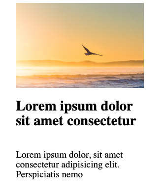
We should have something like this;
Then, position the image absolutely to its parent element, the card itself:
img {
  position: absolute;
  z-index: -3;
  width: 100%;
  height: 100%;
  inset: 0;
  object-fit: cover;
}
We need to place it behind any additional content, and also because we will create a nice effect later on. Notice that we’re not using the ordinary absolute positioning syntax: top: 0, left:0, bottom:0, right: 0. Instead, we’re applying a recent syntax with the use of the inset:0 property.
As a wrap-up, let’s create a screen or layer for the card and the image, using the ::before and ::after pseudo-elements:
.card::before {
  content: "";
  width: 100%;
  height: 100%;
  inset: 0;
  position: absolute;
  background: hsl(10 70% 50%);
  z-index: -1;
  display: block;
  box-sizing: border-box;
  mix-blend-mode: multiply;
}

.card::after {
  content: "";
  width: 100%;
  height: 100%;
  inset: 0;
  position: absolute;
  background: hsl(180 70% 50%);
  z-index: -2;
  display: block;
  box-sizing: border-box;
  mix-blend-mode: soft-light;
}
Here, we position the pseudo-elements one behind the other through the usage of the z-index property: -1 for ::before and -2 for ::after.
Each pseudo-element has a different background we can use to apply a mix-blend-mode value that ultimately, creates the nice effect you can see.
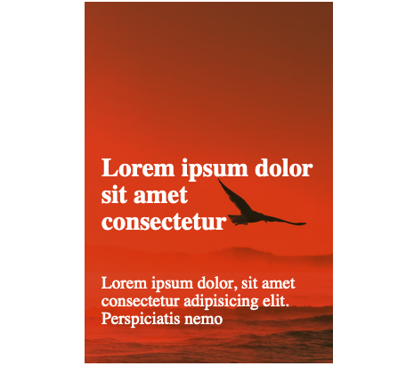
Of course, I changed the text color to white to have a better contrast in the parent .card element.
The mix-blend-mode property is something that makes this implementation nicer and I encourage you to learn more about it, and the different values it can take; just don’t forget that the mixing occurs based on the background colors we have set up in the ::before and ::after pseudo-elements and the image itself.
The finished version of this example you can find it in this Codepen:
I hope you have learned something useful in this post. Any doubts you can contact me, and I’ll be happy to talk about this topic and any other one you may want to chat about. See you next week!